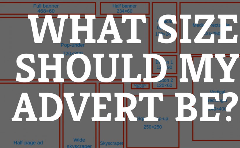
I’ve been working with some clients recently who are primarily used to working with print based publications. So as a result they have been posting adverts on their site that are sized in inches rather than pixels. This has left some adverts unreadable – something I’m working with them to remedy.
So if you are a newcomer to the web then it is important to educate yourself, and your clients or advertisers, in the way of the pixel.
The key thing to remember is that if things don’t look readable on your screen, or look too small, then that will not improve when visitors to your site look at the site.
Take some time to consider the size of computer monitors (in pixels) and how this affects the files you need from those who are sending them to you. Not all screens are equal but there are some good guidelines for web-adverts in place.
The guide below from Wikipedia shows some standard web-banner advert sizes to consider. Also considering font size and reducing the amount of information to the important bits. Remember once a visitor clicks the link you can direct them to a page that has everything they need.
There are some other topics to take into consideration in your approach to this which can be summed up in one word – mobile! The screen sizes for phones and tablets add another dimension to this discussion but we’ll leave this one for another time.
I’m planning to create some video tutorials on this topic in the near future, perhaps including some free image editors that will enable you to create your own adverts.
So please take the time to subscribe to my YouTube Channel to keep yourself updates or check out my mailing list.

